Whether you are looking to design your small space from scratch or you simply want to improve the design you already have, I want to share with you 4 techniques that designers regularly use to help a room look and feel larger and more spacious. I’m also going to share the 4 biggest mistakes I often see homeowners make in their small homes.
Let’s start with the space expanding approaches.
Technique #1 – Use a Focal Point
Now this first technique is definitely one the most important rules for great room design and that is the use of a focal point.Focal points serve multiple purposes, such as, helping you to more easily organize the room design and to help you create a “wow moment” for your room. In a small room, a focal point will also help to distract from the size of the room.
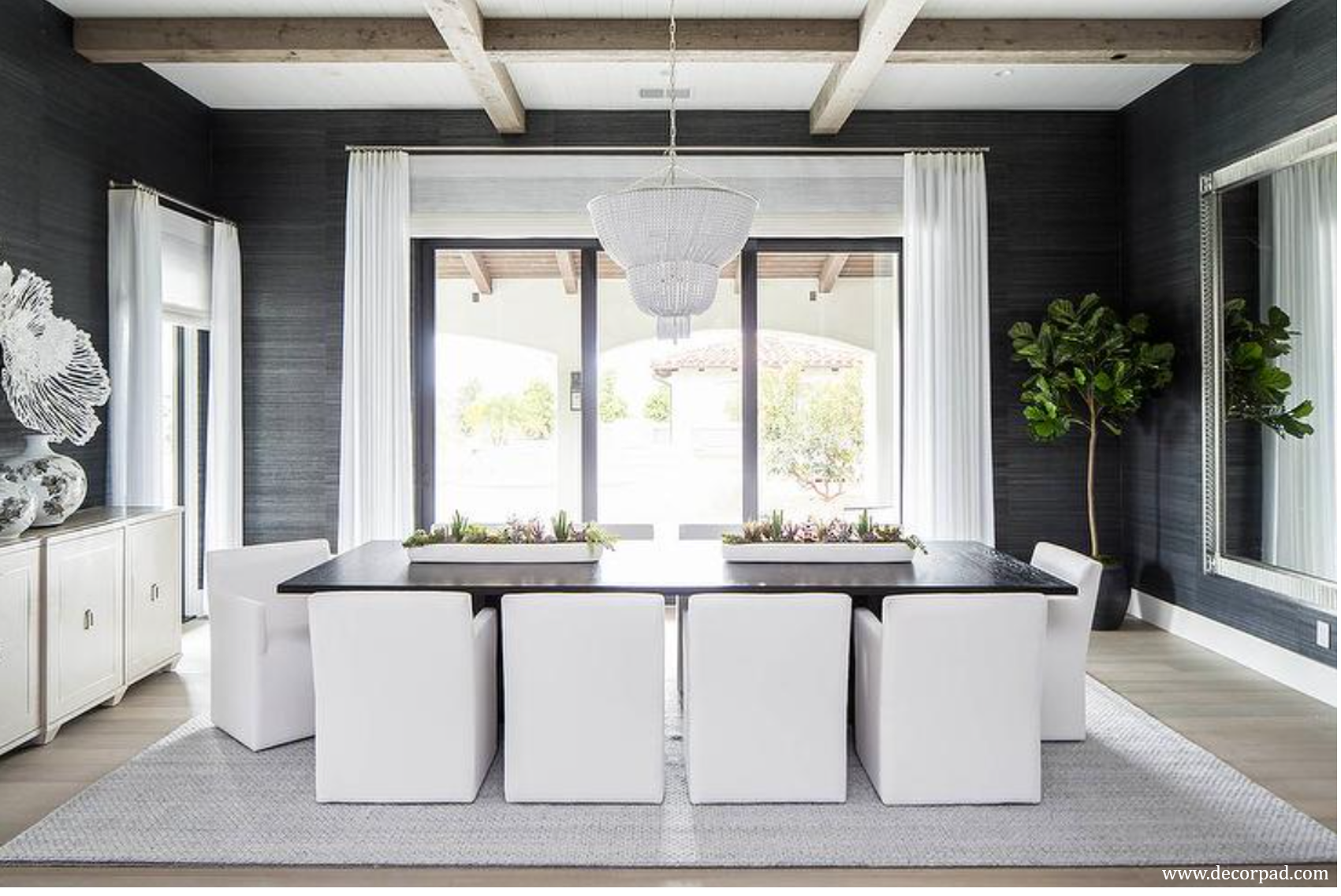
One of the best focal point opportunities for a small room is the ceiling so that it draws your eye upward and helps to emphasize the vertical space. Some of my favorite ceiling treatments, regardless of the room size, include wallpaper, coffered ceilings, ceiling beams, and a bold paint color.
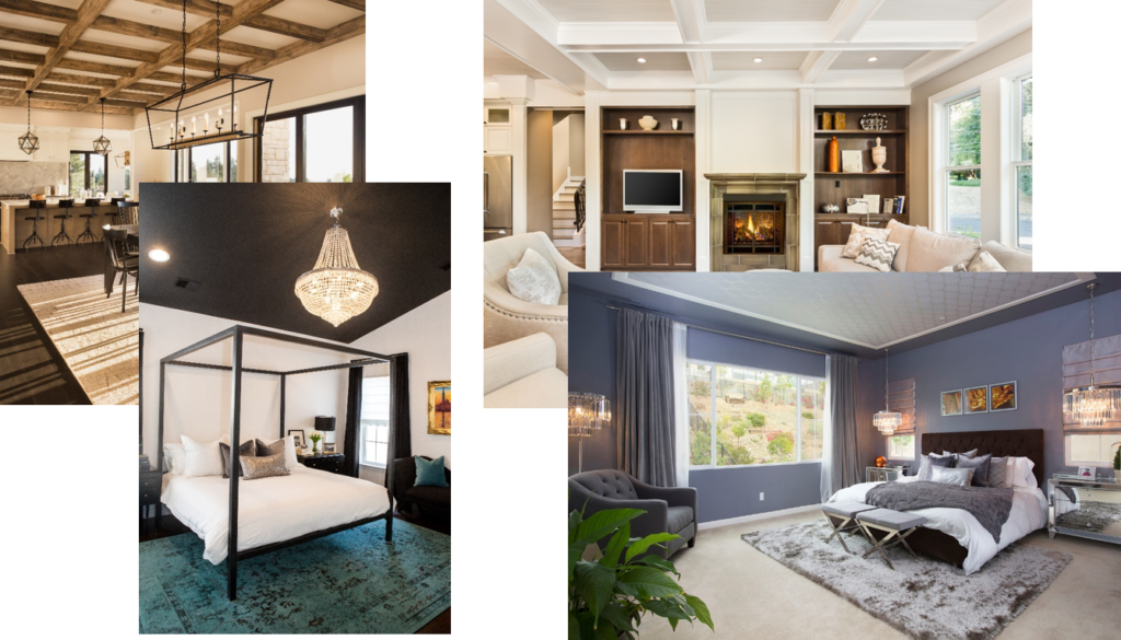
If you go with a dark paint color make it an eggshell or satin finish so that it will reflect a bit of light, as opposed to the flat finish that we typically use on our ceilings. Eye-catching light fixtures, such as chandeliers, pendants and semi-flush mount lights, are also a great focal point for a small room. A large collage of pictures that go nearly to the ceiling is also a great choice as a focal point for a small room, again because it is drawing the eye upwards.
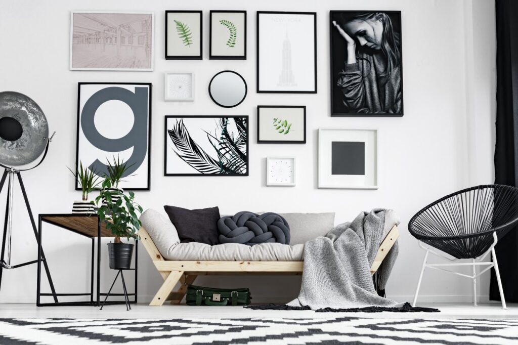
One quick note about collages – in a small room, collages always look best when they are taken close to the ceiling – otherwise, it is better to simply go with a large piece of artwork.
Technique #2 – Think Vertically
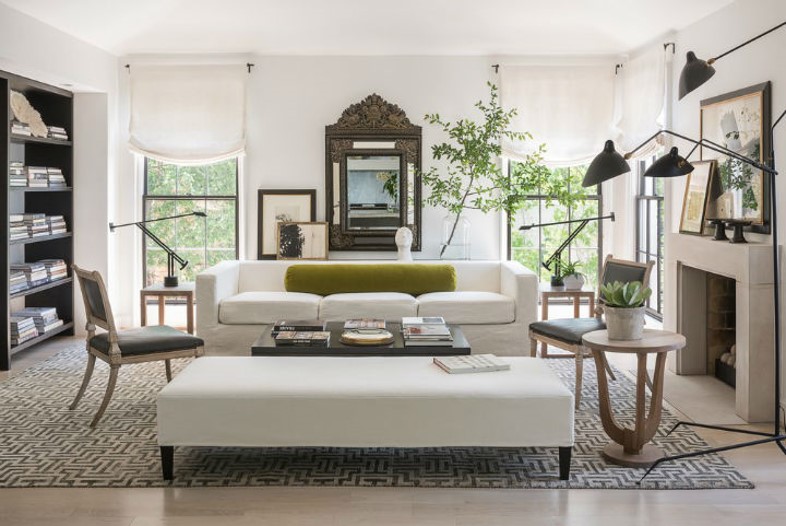
Along these same lines, my second design technique for you is to always think vertically in a small room. For example, when hanging curtains or drapes, hang them high and wide – for an average height ceiling, meaning no more than 9 feet or 2.7 meters, you want to hang them within a few inches of the ceiling or crown molding.
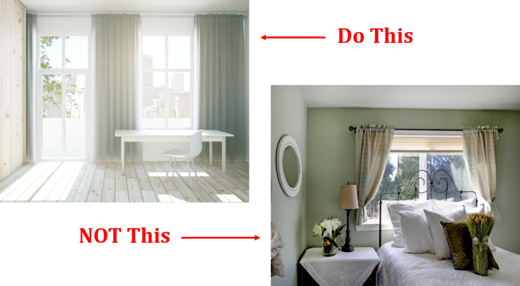
Be sure to hang the inside edge of your curtains or drapes at the edge of your window to maximize daylight in your room, which always helps to visually expand a room. Also, use window treatments that are the same color as your walls – keeping color consistent across the length of your wall prevents the room from feeling smaller and, perhaps interestingly, using window coverings that are the same color as your walls usually will provide a higher end designer look to a room.
Other ways to emphasize a room’s height is to use tall plants or hanging plants, tall bookshelves, built-in bookcases, or a tall arrangement of open shelving.
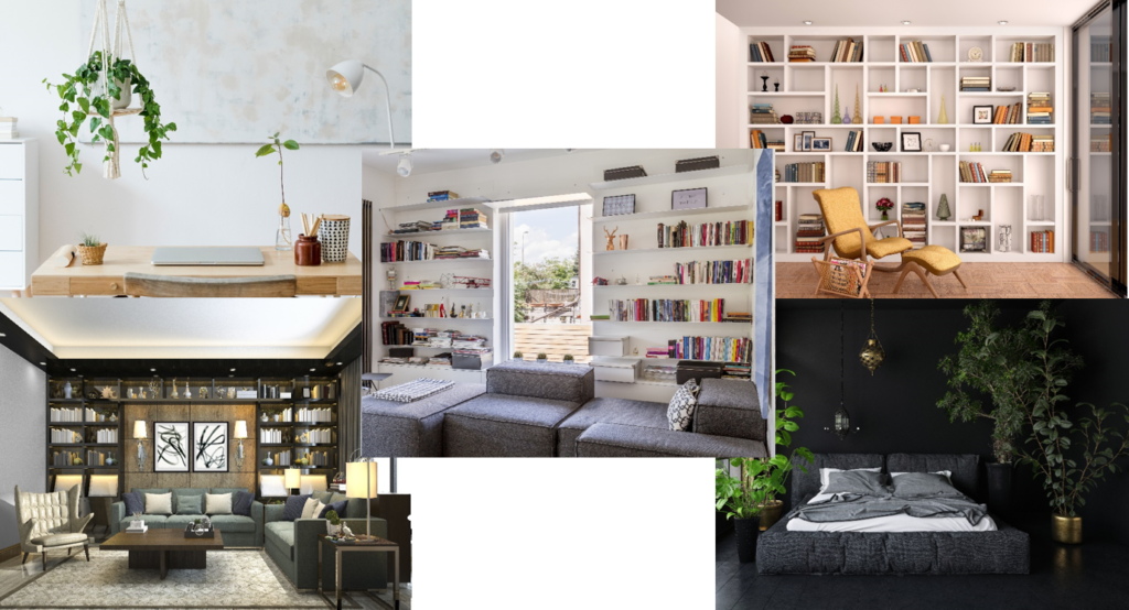
The three latter approaches also have the benefit of providing extra storage to a room – always a plus for a small room.
Technique #3 – Full-Length Mirrors
Third on my list for designers’ most commonly used techniques in a small room is the use of full-length mirrors – really any mirrors, but I particularly like full length if possible. There are three primary ways that I like to use mirrors in a room, particularly a small room. First, designers often use them in a location where you would typically have a window but don’t such as behind a sofa or a console table. Mirrors placed opposite a window also help bounce natural light around a room.
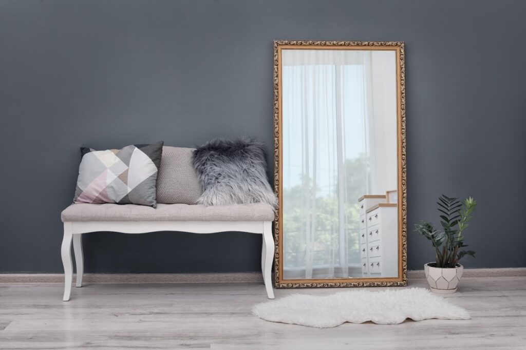
My third favorite placement for full-length mirrors is behind a piece of furniture, such as behind a chair or table – it will actually provide the illusion of another room behind that piece of furniture.
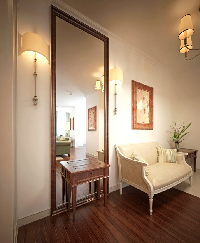
Apart from these three approaches, using full-length mirrors in alcoves and at the end of hallways are also excellent placement options. One important point – do be thoughtful with your mirror placement so you aren’t inadvertently reflecting a problem area in your home.
Technique #4 – Keep Seating Off Your Walls
Fourth and finally, in nearly any living room design, keep your primary seating away from your walls.
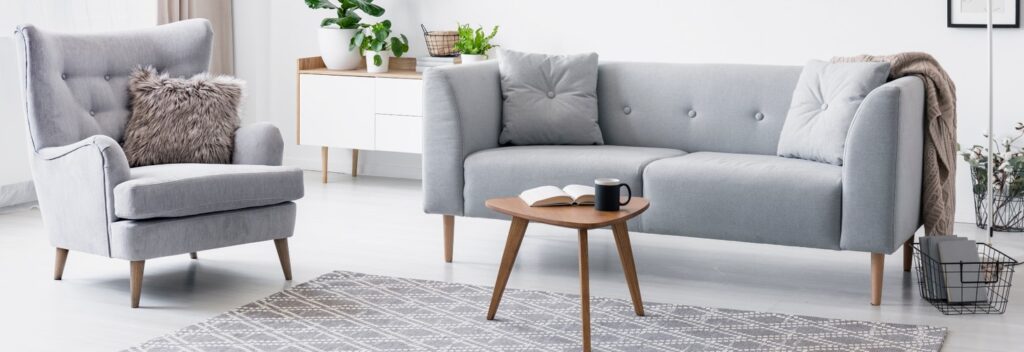
It seems to be instinctual and so common to want to push the sofa and chairs up against the walls. But floating your seating, even just 12 inches or 30 cm or so, will make a big difference in how big or small your room feels.
Now let’s move on to 4 of the biggest mistakes that I see clients often make in their small homes.
Mistake #1 – Too Small Furniture/Rugs
First, and there seems to be so much conflicting information out there about this issue, there is the tendency for people to use furniture and rugs that are too small for their spaces. I am firmly in the design camp that says you should avoid filling your small room with small pieces. Now, that said, you can’t obviously use a high number of large pieces in a small room, but you can and should use 2 larger pieces in each room design, while obviously ensuring that you have adequate clearance.
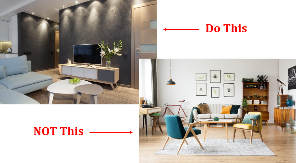
Suffice it to say that a room filled with only small pieces will feel…well, small.
Mistake #2 – Crowded Surfaces
The second mistake that inadvertently happens in many small homes is that every surface eventually gets crowded. I know we all have the best intentions, but let’s be honest, small homes often pose significant storage challenges, so clutter creep is a common phenomenon.
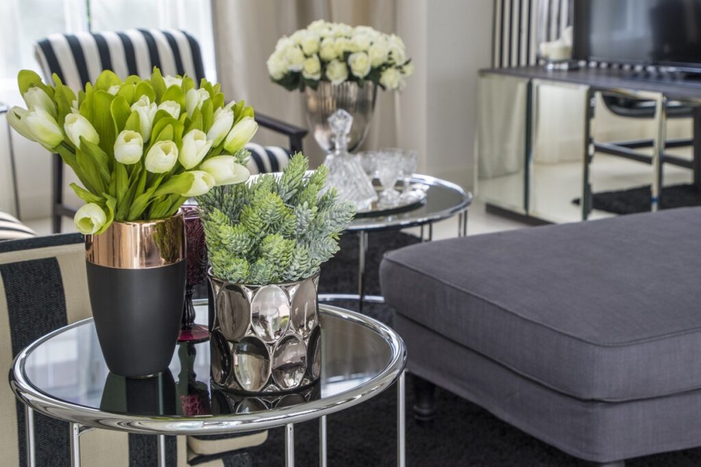
But if you don’t want your room or home to feel smaller than it is, it’s extremely important that you minimize clutter and avoid crowding every flat surface in your home. This holds true for any bookcases and open shelving as well – you want to leave some unused space on these areas, which unconsciously emphasizes how much space you have.
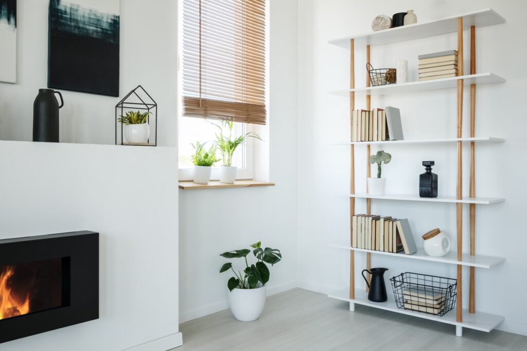
Said another way, unused space means that you have more than enough space and that your home is plenty big – make sense? Great!
Mistake #3 – Relying on Single Light Source
The third biggest design mistake I see many people making is using only a single light source in their room – this is especially problematic for small rooms. So why is that? The main reason is that when you use a single light source, such as a flush mount light, it’s typically not adequate lighting for the entire room and it inadvertently leaves some corners or areas of the room with insufficient lighting. In a small room, you want to ensure that you are illuminating all areas of your room, especially all of your walls and corners. This will definitely help your room to feel larger.
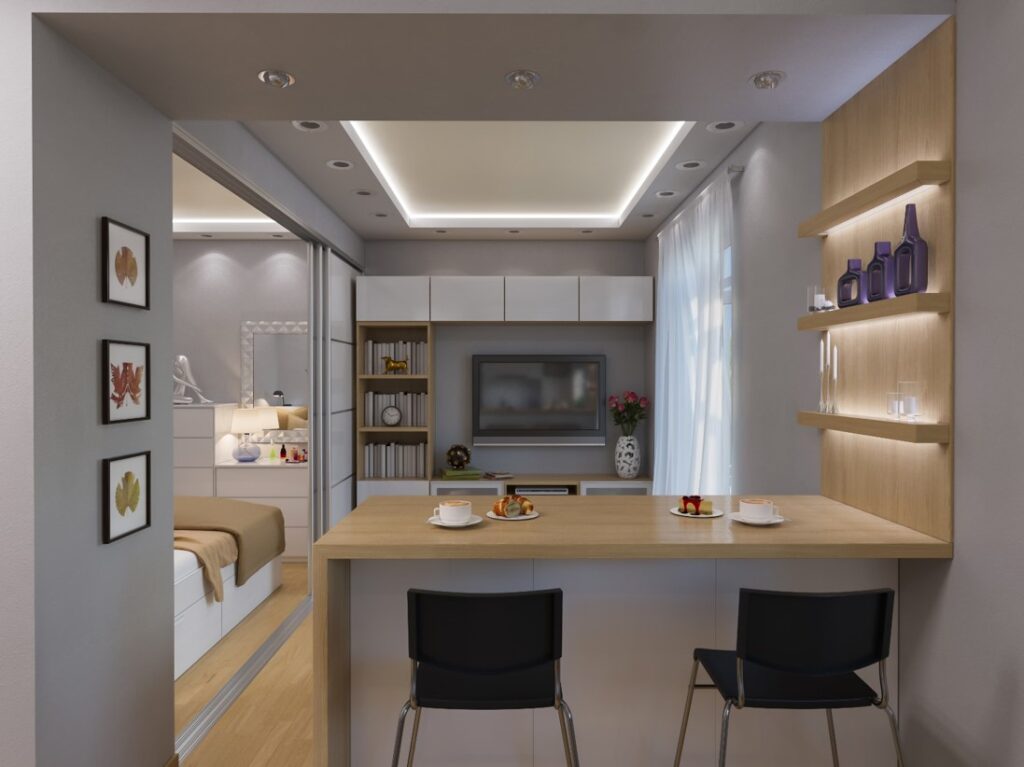
Also, by using multiple light sources at various levels of your room, such as a ceiling fixture, wall sconces, table lamps and floor can uplights, you then create visual interest at all levels, which not only keeps your eye moving around the room but also emphasizes the overall space of the room.
Mistake #4 – Not Properly Measuring
Finally, the fourth biggest mistake that I see clients make is not properly measuring their space before purchasing a large item such as a piece of furniture or a piece of artwork. Obviously, smaller homes generally mean smaller rooms and more chances to make mistakes by purchasing pieces that just don’t fit.
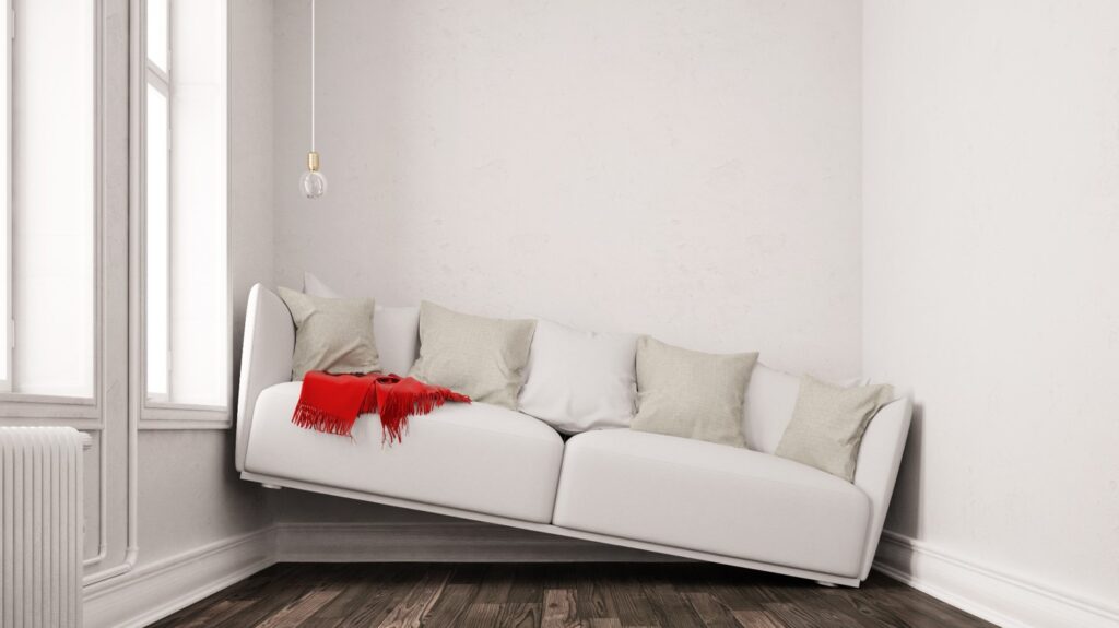
Ouch! And don’t just measure your space, measure your doorways and all access points to your home – for example, if you’re purchasing a new king size bed for your bedroom, measure not only your room to ensure you’ll have adequate walking clearance around your bed, but also measure every doorway that the mattress and headboard will have to come through, including any doors to your building if you live in an apartment, condo, or flat.
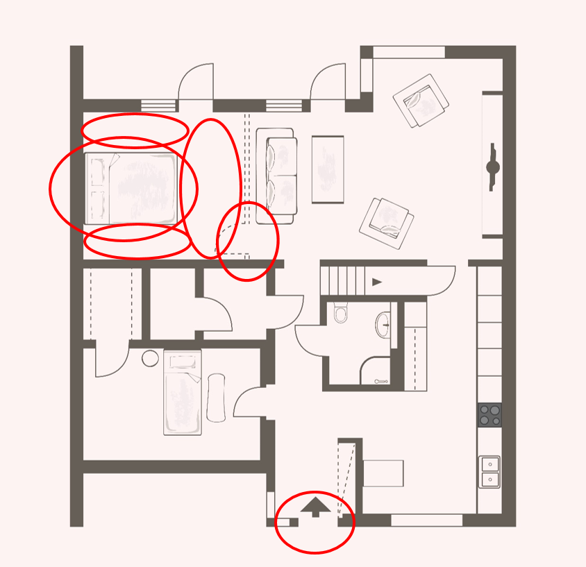
Even professional designers have made mistakes in this area and it’s often a very expensive mistake so my mantra is measure, measure and then measure again!
If you like this post, you may also enjoy my course, “Everything Small Home Design”. where I’ll show you how to make the most out of your space, both functionally and aesthetically, whether you live in an apartment, condo, townhouse, loft, or small single family home.
Happy Decorating!

2 Responses
I was extremely pleased to discover this page. I want to to thank you for ones time due to this wonderful read!! I definitely appreciated every part of it and I have you bookmarked to look at new information on your web site.
Nice post i like it 100 %. I learn something new and challenging on sites I stumbleupon on a daily basis. Its always helpful to read through articles from other writers and use something from their web sites.