Hi everyone and Happy New Year!
One of my very favorite things about a new year is the potential that it holds. Some people like to create resolutions, others go with simple goals, and yet others, like author and podcaster Tim Ferriss, prefer to do a past year review to determine what to proactively do in the new year.

Whatever your preferred approach, I know that many people include home design, redesign, remodeling, or decoration in these aspirations for the new year. But unless you have a large or unlimited budget, usually people need to work with some of what they currently have. So, to that point, I would like to talk about a common design challenge that I get asked as a designer. And that is “how do I incorporate vintage or antique pieces into my modern or contemporary home?”
First, let’s talk about why vintage or antiques?
Well, often we inherit them, sometimes we find something that catches our eye at yard sales or flea markets, sometimes we prefer to save money and/or be more sustainable with second hand items. However you acquire them, unfortunately, many people are at a loss on how to properly integrate them into their homes.
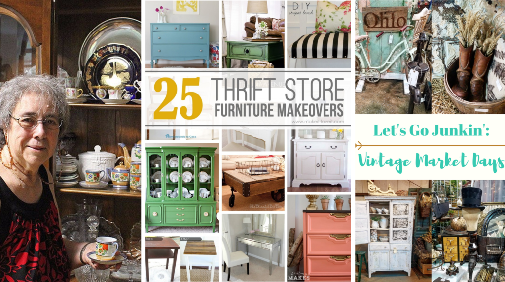
Let me just star by saying that putting the piece in a corner and hoping no one notices is never the way to go. In fact, I and many other designers would argue that mixing modern and/or contemporary with antiques and vintage pieces is always a design forward approach – in fact, for several years, this approach has been part of what’s referred to as creating a curated look for your home.
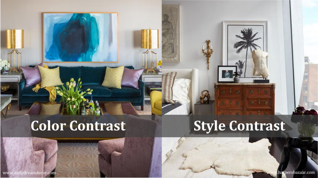
So why does this work? It’s because contrast is a fundamental interior design principle – not just color contrast, but also style contrast. Contrast can help to create just the right amount of tension and energy in a room design.
So now let me share with you 3 easy to use, failsafe approaches.
Approach #1: Use the Piece as a Focal Point
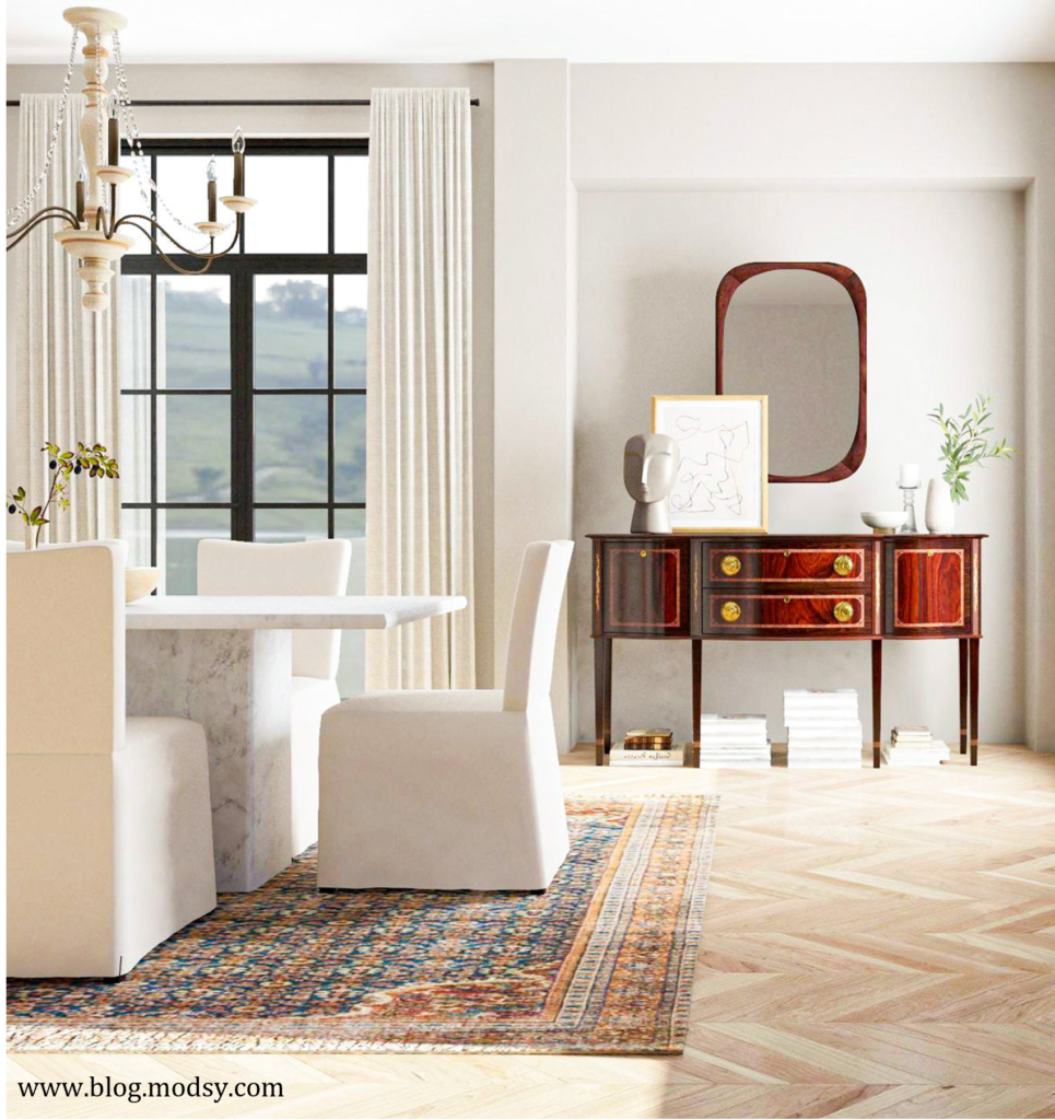
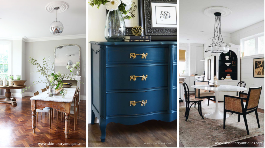
This is a great approach for a large cabinet, dresser, or console (like we see below), a coffee table, a large mirror, or even a gorgeous chandelier.
Approach #2: Pair It
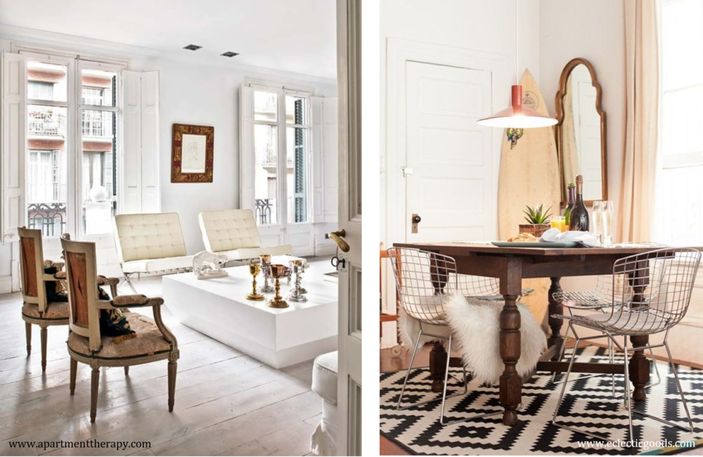
Pair an antique or vintage piece with a contemporary or modern item, like a vintage table and contemporary or modern chairs, or antique chairs added to a contemporary space, or an antique table with contemporary artwork.
Approach #3 – Update It
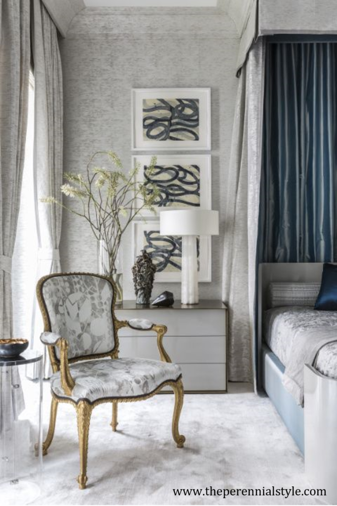
Update a vintage or antique piece with upholstery or paint. Below is a great example of a vintage chair that was reupholstered with a contemporary print. By making this change, they have easily integrated the piece to harmonize with the room design. To update an antique or vintage casegood item, especially if the finish is in poor shape, sand and repaint it in one of the room’s accent colors.
Important Design Guidelines
Of course, it’s not just about using one of these approaches. To do it well, you will also need to follow some important design guidelines.
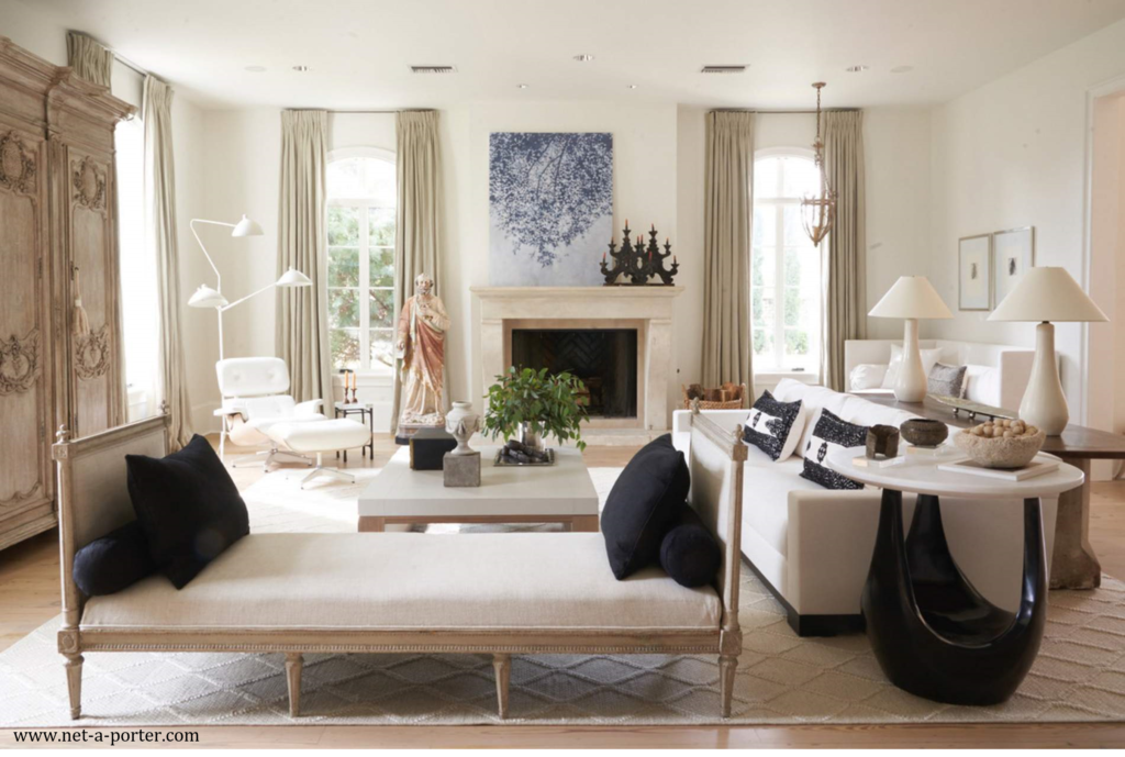
First, you need to make sure that you incorporate harmony with your vintage or antique piece. You might remember that harmony, just like contrast, is another fundamental design principle and refers to the idea that all of your elements fit together well visually, which is often achieved through repetition. So to create harmony when introducing an antique or vintage piece of two, find a way to incorporate some harmony with your other pieces. Probably the easiest way to do this is through a cohesive color scheme, meaning the repetition of colors, which really, is always important when create a room design. However, you could also achieve this through the repetition of textures or the repetition of styles – all of which we see incorporated into the room below.
Second, be mindful and strategic when mixing different wood tones. In general, you can’t go wrong when you combine cool wood tones with other cool wood tones and warm wood tones with other warm wood tones. Neutral tone woods can be mixed with cool or warm.
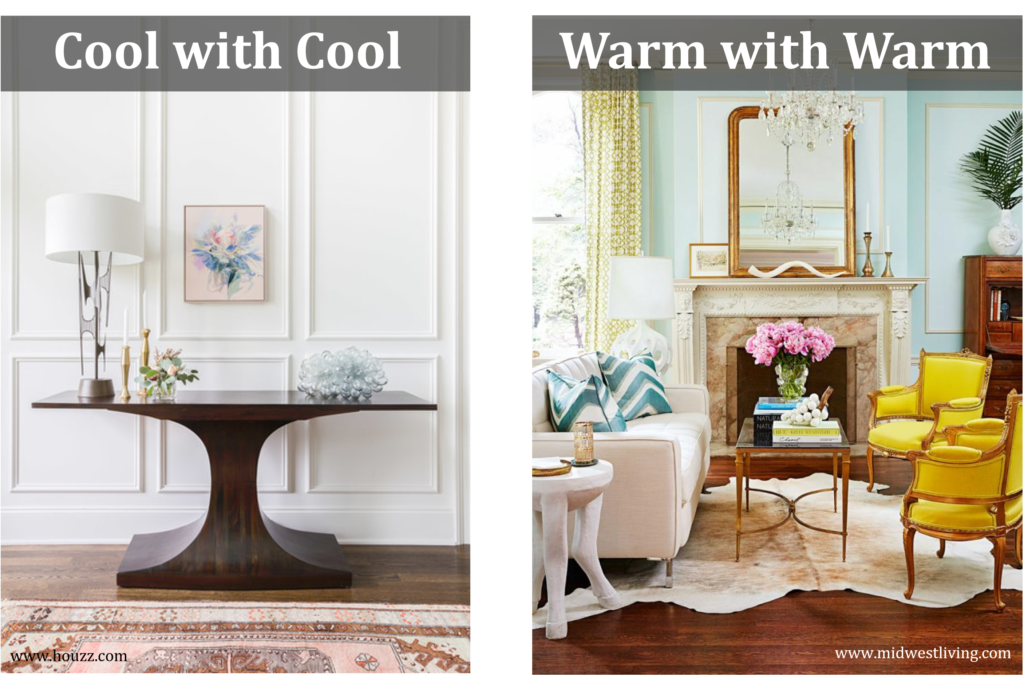
The one exception is flooring – provided that you use a rug separating your furniture from your floor, it’s almost never a problem to combine warm with cool.
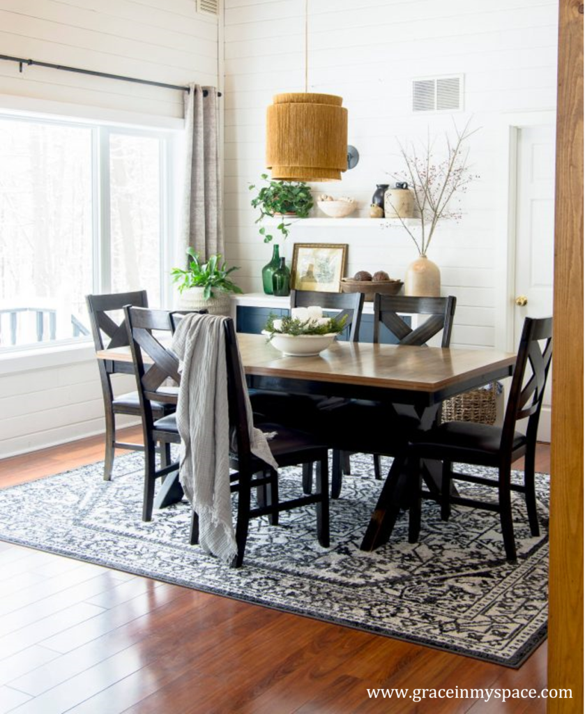
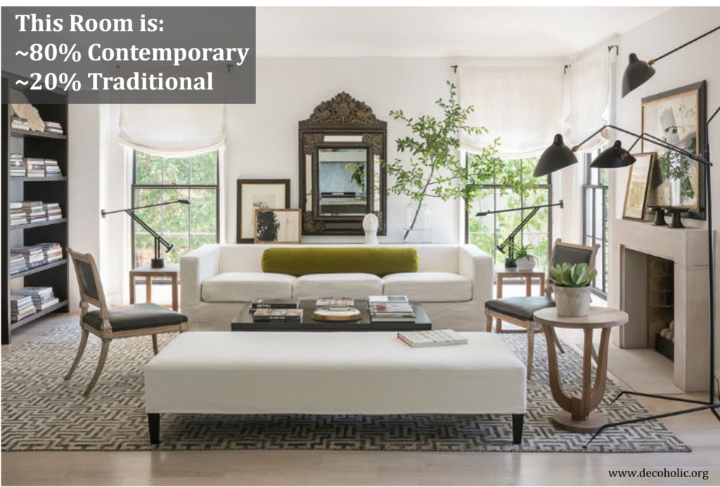
Third, if you are mixing different styles, use the 80/20 rule to have your room look cohesive instead of chaotic. It’s simple – aim to have approximately 80% of your room or home in a primary style and 20% of your room or home in a secondary style. If you want to learn more about how to mix styles well, check out my course, “How to Work with Interior Design Styles Like a Pro”.
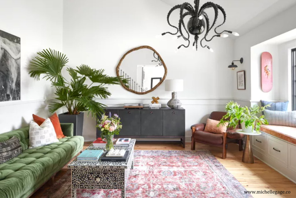
Fourth and finally, while color and style contrast are generally considered optional design choices, I personally think a design is nearly always better when you have texture contrast, especially when working with vintage or antiques. In this room below, we have so many different textures going on – velvet, metal, wood, leather, wool, the super cool octopus fixture with the fantastic bumpiness of the tentacles, as well as the plants, add a ton of visual interest to this space.
How to Easily Add Vintage Items / Antiques
If you want to add some vintage or antiques to your home, light fixtures, rugs, and artwork are 3 of the easiest ways to do this. But of course, as you’ve now seen, any item in a room can be vintage or antique, including tables, seating, and casegood items.
2 Case Studies
Now let’s look at some rooms together to see how they’ve successfully integrated vintage or antique pieces.
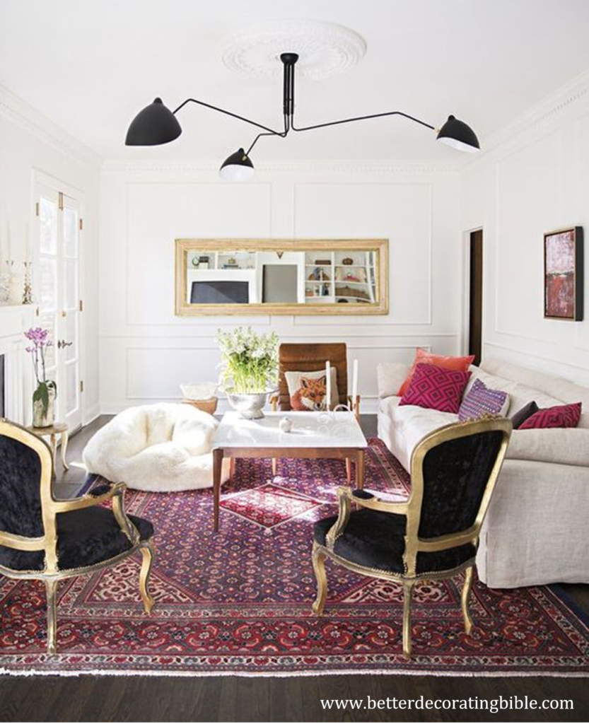
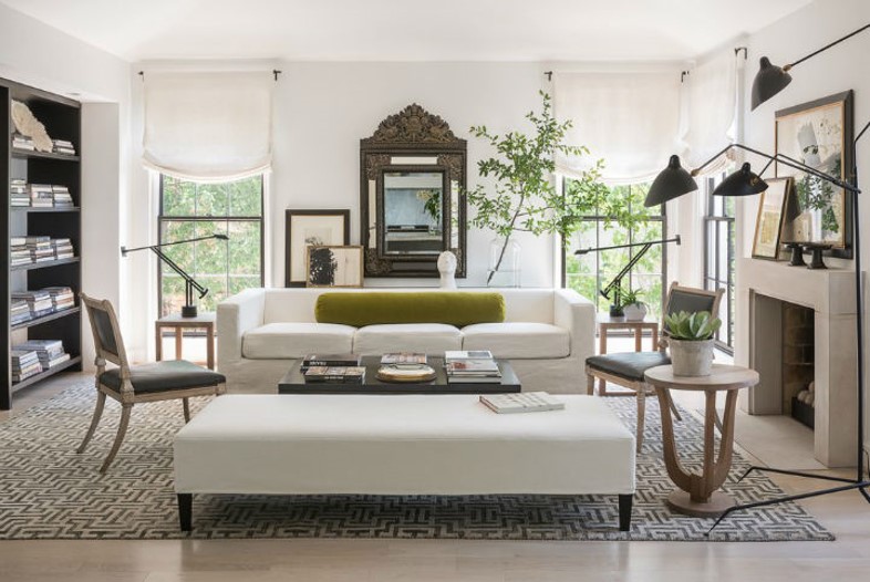
In this first room below, I’m sure most of you will immediately spot the two antique chairs in the foreground. This is an example of Approach #2 (“Pair It”). Despite the rest of the very contemporary furnishings, these chairs work well – why is that? Well, first, they’ve ensured harmony by repeating the black from the light fixture, the gold frames are similar in tone to the mirror frame, and they’ve repeated curves of the chairs in other areas of the design. In terms of style mixing, most of the room is contemporary with just the chairs and the rugs in the traditional style. Finally, they’ve done a good job of adding a variety of textures to this space to reinforce this stylish, dynamic design.
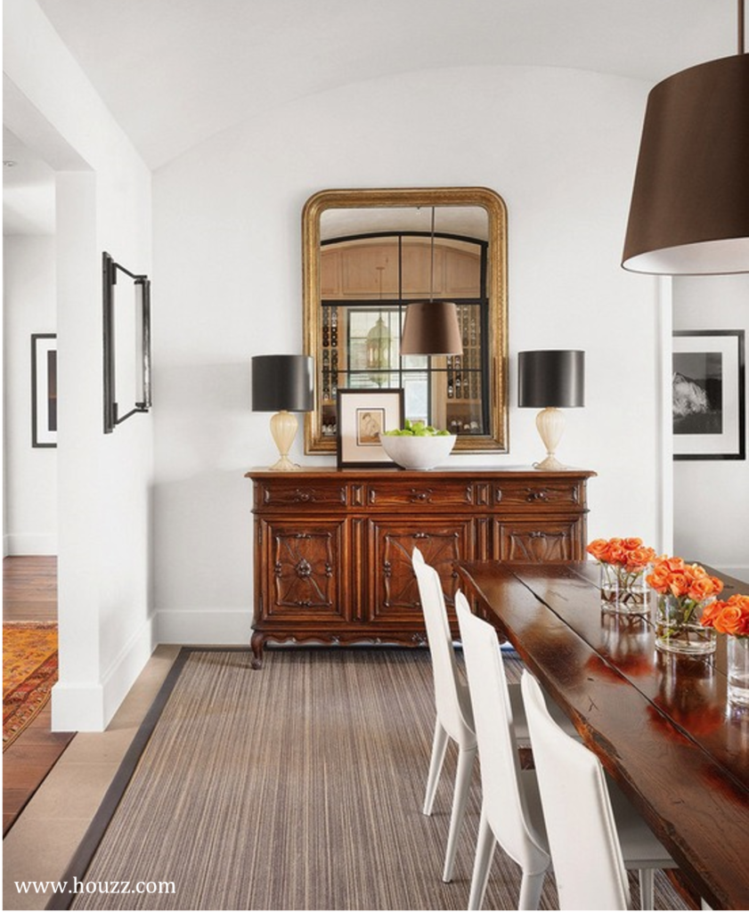
How about this room? Here we have approach #1 (“Use the Piece as a Focal Point”). This buffet is clearly the focal point further reinforced by the mirror above it. Harmony is achieved through similar warm wood tones and the overall cohesive color scheme. Also, in terms of contrast, this design has it all – color, style, and texture contrast!
So there you go – 3 easy foolproof approaches to incorporating vintage or antique pieces into a modern and/or contemporary home. I hope you found this information helpful! If you enjoyed this post, please subscribe so you can be notified of future interior design blog posts.
Happy Decorating!

3 Responses
I was extremely pleased to discover this page. I want to to thank you for ones time due to this wonderful read!! I definitely appreciated every part of it and I have you bookmarked to look at new information on your web site.
Right here is the perfect web site for anyone who hopes to find out about this topic. You understand a whole lot its almost hard to argue with you (not that I actually would want toÖHaHa). You definitely put a new spin on a topic that has been discussed for decades. Excellent stuff, just great!
Nice post i like it 100 %. I learn something new and challenging on sites I stumbleupon on a daily basis. Its always helpful to read through articles from other writers and use something from their web sites.